The newspaper's web page The guardian recently published a interactive application that allows to know by age, sex, geographic region, the number or percentage of deaths and the causes that produce it. It is a work of the Institute for Health Metrics and Evaluation with which you can entertain yourself until you find out what we are going to die from even with statistical data. The data that can be chosen are those of the 1990s or 2010.
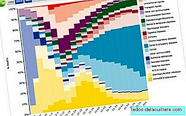
In the graph that appears first in the article you can see what is the most frequent cause of mortality by age in 2010. For ages that refer to Children the most frequent causes are AIDS, diarrhea and childbirth problems so it is necessary to perform an analysis by regions to know what happens in the different areas of the Earth.

So for example among 10 and 14 year old children the most frequent cause of death occurs in the Caribbean area due to war. In Europe it seems that the most frequent causes are caused by cancer or traffic accidents. In any case, the graph shows the percentages, in number of deaths or ratio of cases, the graphs vary significantly.

Between 5 and 9 years, there is hardly any variation with the previous graph except for the number of deaths from the war. I imagine that as soon as the children are old enough to carry weapons, they become soldiers with a significant impact on their mortality.
The graphics allow a very achieved interactivity and are terribly addictive to know details by age, types of death, geographical areas and more statistics: absolute numbers, deaths per 100,000 cases or percentage over the total.
In Microsiervos they have analyzed that among the men of western Europe of more than 30 years the main cause of deaths is cancer, followed by cardiovascular diseases. And, they also emphasize that up to 30 years of age it is more likely to die in an accident on some means of transport than cancer or cardiovascular disease.
As each person will be able to find the utility in the graph, it is only left with the link to the Guardian newspaper so that you can try the application seeing how the figures change when some regions and others of the Earth are compared and that I think you can say that they have a lot to do with the level of well-being achieved in each country of the world.
And finally, in Microsiervos, they have just published a beautiful video, full of emotion, passion, graphics and information superbly played by Hans Rosling in which it presents the advances that are taking place between developed and developing countries to end infant mortality. It is surprising because although the mortality was very high the number of children born was 5-6 per woman. At present, this rate has decreased markedly throughout the world and with it child mortality thanks to a greater development of countries. Among the last to reach levels of Europe in the 60s of the last century, Ethiopia with very high rates of infant mortality.
There is an article of the most complete although a bit dizzy with so many graphs, figures and possibilities for analysis. Even so, it is possible that in a few years success will be achieved by combining all activities: disease prevention, family planning and country development.